

I tweeted the above some time back. Realising this was one of the key to how we were able to put together a Design system for the Belong Family of products.
How to get started
When I joined Belong 4 years back, there was already a basic live product being actively used. We really didn’t have the luxury to spend dedicated time and people to work on a Design System then. To get started working on a Design System, you should make peace with the fact that you will never be given dedicated time to do it, especially in a startup.
So pick a small UI element and start figuring out how to make it uniform/consistent across the product. We picked buttons! Buttons were the easiest place to start. The idea is to just get started.
The challenges
We identified 3 main challenges we should address if we want this Design System to succeed.
Building it without affecting normal work.
Buy-in and adoption from stakeholders (Designers and Frontend developer)
Continuous improvement and evolution of the Design System as the Products evolves.
Our approach
I’ve seen good Design Systems being built only to fail eventually as the team suppose to take advantage of the Design System fails to adopt it. Yes! building a Design System for your internal team is just another UX problem solving exercise where you have to empathise with the user and figure out ways to drive adoption. We found our answer to this problem in the following.
Participation in the creation process
Ownership is key to adoption and while we haven’t figured out a simple and repeatable formulae to make this happen, acknowledging this and actively trying to drive it has been fruitful.
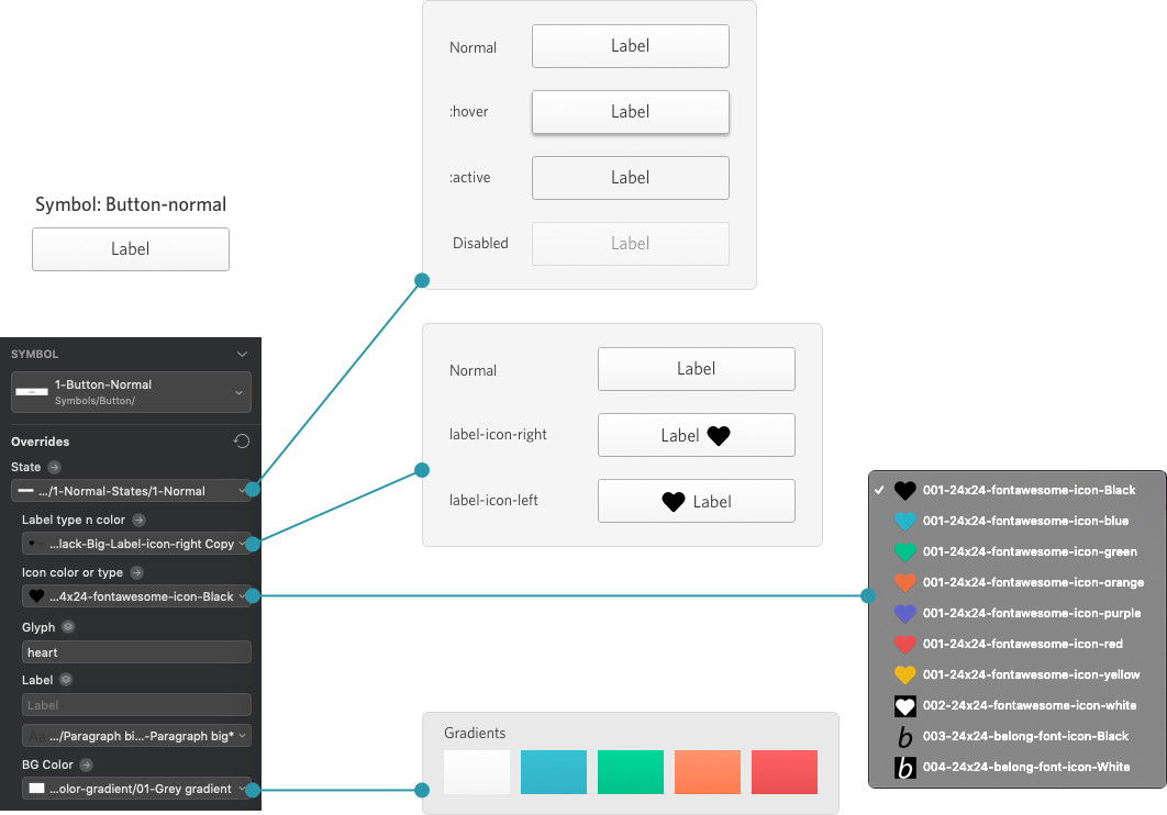
Enforced discipline through a live pattern library
The developer is the ultimate gatekeeper to making sure what gets shipped respects the Design System. So we established a very clear understanding with the developer that no custom codes will be written to create a specific UI. If it’s not in the live pattern library, it won’t be implemented. This became so efficient that in a few instances, I gave a block diagram to our developer and he put together the exact UI I would have created, directly in code.
This pattern library is an open source project and you can find it here https://engineering.belong.co/belong-ui/
Pattern Driven Design
(Totally original and has got nothing to do with “Test Driven Development” 😄) It’s a simple concept. It has only 2 basic points.
If what you need in your UI is not in the pattern library, add it to the pattern library first. (Avoid duplication)
Don’t add anything in the pattern library which will be used only once.
We are a small team of about 6 to 7 Designers and our product is not very complex from a UI standpoint. This approach has served us well and we believe as long as we keep evolving and building on top of this framework, we should be fine.
The rest of the stuff are detail in technical implementation and some clever tricks to collaborate and work on the Design System as a team. I’ll cover some specific examples below.
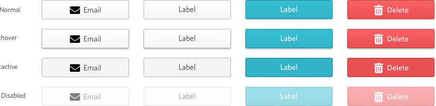
One button to rule them all
We ended up having just one button as the base symbol and every other button was a variation of it. This limited the variation of how buttons look through out the product. All the buttons that you see at the top of this post was all created from a single symbol using overrides.
Button normal
Button dropdown
Well it was not just one button to rule them all, we had to create separate button for dropdown buttons.

A special shout out to Akshansh Deva who interned with us briefly and worked with us on the Design guidelines. He has written his own blog on this project.
Defining Design Guidelines at Belong.co
